Thursday, 25 February 2016

Congratulations!

This week's challenge on Less is More is to make a card with texture. I used one of Tim Holtz' embossing folders for this card, highlighting the words by brushing on some distress ink. I then embossed the sentiment on vellum - I like this effect. Finally I attached the panel to a linen card.


I am also entering this card into CASology challenge where the cue card is distress - I used distress ink to highlight the words.

Materials used:-
Sissix embossing folder - Tim Holtz alterations
DI - picked raspberry applied with an Inkylicious ink blending brush
Sentiment - Stampin Up "Sassy Salutations"
Pearl silver embossing powder
Linen card

Thanks for visiting my blog - I really appreciate your comments! Margaret

Thursday, 18 February 2016

Butterfly hello

This week's challenge on Less is More is to make a one layer card and include a stem on it.  As I have lots of flower stamps I thought this would be easy. I wanted to use a new Stampin Up set but it took lots of attempts to get something I was reasonably happy with.  Although I like the water colour effect, I feel the proportions are not quite right. 

I am also going to enter this card into the Addicted to CAS challenge where the code word is bloom.

Click the image for our current challenge


Materials used:-
Stampin Up Garden Bloom set
Sentiment - Stampin Up Four You
Inks - versa color bamboo, green tea, boysenberry, grape

Thanks for visiting my blog!

Monday, 8 February 2016

More butterflies!

This month's CAS challenge on Happy Little Stampers is to use an embossing folder for stamping.  This is a technique I have never tried before and I quite like the result - although you do not have much control over how it will turn out!  If you want to find out more about the technique pop over to the Happy Little Stampers blog.


Materials used:-
Embossing folder - Craft Concepts "wings" sprayed with distress spray stain in broken china
Sentiment - Penny Black snippets inked with Versafine Onyx black ink
Dies - Die-Namics pierced rectangles

Thanks for visiting my blog - I really appreciate all your comments.  Margaret

Friend

The One Layer Simplicity Challenge this month is to make a one layer card containing the word "friend".  I made this card for a good friend who loves butterflies and the colour purple!


Materials used:-
Butterfly stamps - Martha Stewart
Sentiment - Chocolate Baroque Mackintosh Sentiments
Distress inks - dusty concord and milled lavender applied with an Inklicious ink duster
Versacolor - grape

Thanks for visiting my blog!  I really appreciate your comments - Margaret

Sunday, 31 January 2016

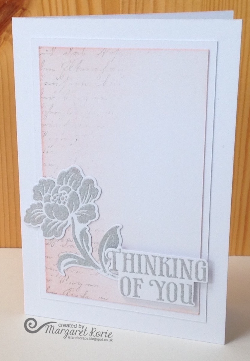
Thinking of you

I am delighted to be back after a break of a few months - I've been very busy recently and not had any time to take part in challenges.  However when I saw that Jenni was the guest designer on Muse this week I decided to take part.  I really like Jenni's clean and simple style and so my card is nearly a CASE of her Muse card.  I liked her use of the die cut flower and the subtle background text - see her card below. I used pearl silver embossing powder on my card which unfortunately doesn't show up very well in the photo. 


Materials used:-
Hero Arts stamps and matching dies
Hero Arts script stamp "Old letter writing"
Archival ink - watering can and distress ink - tattered rose
Pearl silver embossing powder

Thanks for visiting my blog - I really appreciate your comments.  Margaret

Sunday, 18 October 2015

Merry Monday Moose!

Challenge #175 on Merry Monday is to create a Christmas card with a moose on it.  Although I have seen a moose when on holiday in Canada, I don't have a moose stamp so had to make a reindeer card instead.  I am also going to enter this card into the theme challenge at 52 {Christmas} Card Throwdown which is The Wild Woods.


Materials used:-
Distress inks - broken china and seedless preserves
Archival cobalt ink and black onyx Versafine ink
Stamps - tree stamp by Clarity and other stamps from Creative Stamping magazine issue 27 Woodland Christmas

Thanks for visiting!

Wednesday, 14 October 2015

Muse Note

Michele Ferguson has created a great card using designer paper on this week's Muse challenge.  My card was inspired by Michele's design and her use of a die cut word.  The gold paper I used was quite thin so I stuck it on 2 layers of cream card to give it some definition.


Materials used:-
Graphic 45 Typography papers
Stamps - Vintage Typewriter by Sam Poole
Thanks die - Lil'inker designs
Gold paper and cream card from stash
Black onyx Versafine ink
DI -  vintage photo for the edges

Thanks for visiting my blog - now pop over to Muse and see how the other participants were inspired by Michele's card.